prop()
<!DOCTYPE html>
<html>
<head>
<meta charset="UTF-8">
<title>함수 사용하기:version 9d에서 새롭게 추가</title>
<style type="text/css">

</style>

<script src="https://ajax.googleapis.com/ajax/libs/jquery/3.5.1/jquery.min.js"></script>
<script type="text/javascript">
$(function(){
	//체크하기 버튼을 클릭하면
	$('#checkBtn').on('click', function() {
		$('#mailing').prop('checked', true);
	})
	//체크해제하기 버튼을 클릭하면
	$('#checkBtn2').on('click', function() {
		$('#mailing').prop('checked', false);
	})
});
</script>
</head>
<body>
메일확인::<input type="checkbox" id="mailing">
<input type="button" value="체크하기" id="checkBtn">
<input type="button" value="체크해제" id="checkBtn2">


</body>
</html>
prop 응용
<!DOCTYPE html>
<html>
<head>
<meta charset="UTF-8">
<title>함수 사용하기:version 9d에서 새롭게 추가</title>
<style type="text/css">

</style>

<script src="https://ajax.googleapis.com/ajax/libs/jquery/3.5.1/jquery.min.js"></script>
<script type="text/javascript">
$(function(){
	//1. allCheck을 클릭하면 모든 메뉴 부분이 동시에 체크가 되도록 작성....
	/* $(':checkbox[name="allCheck"]').change(function(){
		if($(this).prop('checked', true)){
			$('input[name="menu"]').prop('checked', true);
		}
	}) */
	//2.
	//내가 짠 코드
/* 	$(':checkbox[name="allCheck"]').click(function(){
		if($(this).is(':checked')){
			$('input[name="menu"]').prop('checked', true);
		}else{
			$('input[name="menu"]').prop('checked', false);
		}
	}) */
	//선생님 풀이
	$(':checkbox[name="allCheck"]').change(function(){
	var allCheck=$(this).prop('checked');
		$('input[name="menu"]').prop('checked', allCheck);
	});
});
</script>
</head>
<body>
<h3>메뉴 선택하기</h3>
<table border='2' bgcolor='yellow' width='400'>
	<tr>
		<td><input type="checkbox" name="allCheck"></td>
		<td>전체선택</td>
	</tr>
	<tr>
		<td><input type="checkbox" name="menu"></td>
		<td>짜장면</td>
	</tr>
	<tr>
		<td><input type="checkbox" name="menu"></td>
		<td>짬뽕</td>
	</tr>
	<tr>
		<td><input type="checkbox" name="menu"></td>
		<td>탕슉</td>
	</tr>
	<tr>
		<td><input type="checkbox" name="menu"></td>
		<td>양장피</td>
	</tr>
</table>

</body>
</html>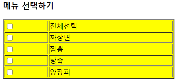
form 정리하기
<!DOCTYPE html>
<html>
<head>
<meta charset="UTF-8">
<title>Insert title here</title>
<style type="text/css">
</style>

<script
	src="https://ajax.googleapis.com/ajax/libs/jquery/3.5.1/jquery.min.js"></script>
<script type="text/javascript">
	$(function() {

		//1. form에 입력된 값을 다 가지고 action에 연결된 페이지로 이동, 전송하는 함수를 사용합니다.
		$('#frm').submit(function(event) {
			//alert('submit');실행되는지 확인

		//2. id, pass 입력된 값을 각각의 변수에 할당
			//alert창으로 값 확인하고 폼 초기화합니다. 포커스도 맞춥니다.
			var id = $('#id').val();
			var pass = $('#pass').val();
			alert(id + "," + pass);
			$('#id').val("").focus();
			$('#pass').val("")

			//2. submit 이벤트 작동 안하도록(
			//1) return false;
			//2)event를 인자값으로 주고 아래와 같은 함수르 써줍니다.
			event.preventDefault();

		//3. checkbox에서 취미를 하나도 선택하지 않으면 alert하고 하나이상 선택하면 alert를 합니다.
			if ($('input[name="hobby"]:checked').length == 0) {
				//checked속성: checkbox, radio-> select는 아닙니다.: selected 속성 또는 val()을 통해 가져옵니다.
				alert("하는 선택해야합니다. ")
			} else {
				//each...array
				var arr = $('input[name="hobby"]:checked');
				var str = '';
				/*1) arr.each(function() {
					str+=$(this).val()+" ";
					});*/

			/*2)$.each(arr, function(index, item) {
					str += item.value + " ";
				}); */
				$.each(arr, function(index) {
					str += arr[index].value + " ";
				});
				alert("당신이 선택한 취미는 " + str);
		}//else
			alert($('select>option:selected').val());
			alert($('#hp').val());
	});//submit
	//4.select폼에서 선택한 번호가 resultView영역에 뿌려지도록합니다. select는 click이 아니라 change입니다.
	$('#hp').change(function() {
		$('#resultView').html('<font color=red>'+$(this).val()+'</font>');
	})
});
</script>
</head>
<body>
	<form action="09_result.jsp" id="frm">
		ID<input type="text" id="id">
		<p>
			PASSWORD<input type="text" id="pass">
		<p>
		<p>
			<strong>당신의 취미를 고르세요</strong> <input type="checkbox" name="hobby"
				value="Rading">Reading<br> <input type="checkbox"
				name="hobby" value="Walking">Walking<br> <input
				type="checkbox" name="hobby" value="ListeningToMusic">ListeningToMusic<br>
			<input type="checkbox" name="hobby" value="Dringking">Dringking<br>
		<hr>
		<select id="hp" multiple="multiple" name="hp">
			<option>010</option>
			<option>011</option>
			<option>017</option>
		</select>
		<p>
			<input type="submit" value="send">
	</form>
	<div id="resultView"></div>
</body>
</html>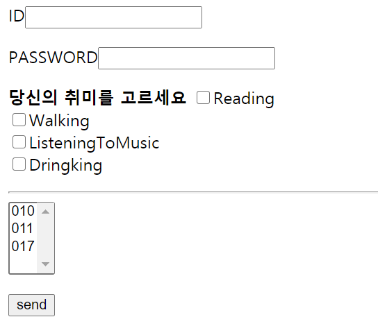
bootstrap
html5+css+javascript(JQuery)= front-end의 framework
getstarted
<!DOCTYPE html>
<html lang="en">
<head>
  <title>Bootstrap Example</title>
  <meta charset="utf-8">
  <!--
  width=device-width: 페이지의 너비를 기기의 스크린 너비로 조정합니다.
  initial-scale=1: 처음 페이지 로딩할때 확대/축소 되지 않는 원래크기로 사용하겠다는 말입니다.(0~1사이의 값)
   -->
  <meta name="viewport" content="width=device-width, initial-scale=1">
  <link rel="stylesheet" href="https://maxcdn.bootstrapcdn.com/bootstrap/3.4.1/css/bootstrap.min.css">

  <!--bootstrap 라이브러리를 인크루드 하기전에 반드시 jquery 라이브러리를 먼저 인크루드 해야한다.-->
  <!--JQuery를 기반으로 bootstrap을 만들었기 때문에 아래와 같은 순서가 중요합니다.-->
  <script src="https://ajax.googleapis.com/ajax/libs/jquery/3.5.1/jquery.min.js"></script>
  <script src="https://maxcdn.bootstrapcdn.com/bootstrap/3.4.1/js/bootstrap.min.js"></script>
</head>
<body>

<div class="jumbotron text-center">
  <h1>My First Bootstrap Page</h1>
  <p>Resize this responsive page to see the effect!</p>
</div>

<!-- 부트스트랩 그리드 grid
한줄은 기본적으로 12칸으로 구성되어져 있습니다
ex) 정확히 한줄을 3등분 하고 싶으면, <div clss="col-sm-4">로 해줍니다.
디바이스 크기
- 가장 작은 크기(모바일)--너비 768px-xs
- 중간크기(태블릿)--768px이상-sm
- 중간크기(노트북)--992px-md
- 가장 큰 크기(데스크탑)--1200px-lg
 -->
<div class="container">
<!--   <div class="row">
    <div class="col-sm-4">12 col이 기본입니다. 4니까 3등분 한 것입니다. sm은 small의 약자입니다.
      <h3>Column 1</h3>
      <p>Lorem ipsum dolor sit amet, consectetur adipisicing elit...</p>
      <p>Ut enim ad minim veniam, quis nostrud exercitation ullamco laboris...</p>
    </div>
    <div class="col-sm-4">
      <h3>Column 2</h3>
      <p>Lorem ipsum dolor sit amet, consectetur adipisicing elit...</p>
      <p>Ut enim ad minim veniam, quis nostrud exercitation ullamco laboris...</p>
    </div>
    <div class="col-sm-4">
      <h3>Column 3</h3>
      <p>Lorem ipsum dolor sit amet, consectetur adipisicing elit...</p>
      <p>Ut enim ad minim veniam, quis nostrud exercitation ullamco laboris...</p>
    </div>
  </div> -->
      <div class="col-lg-6">
      <h3>Column 2</h3>
      <p>Lorem ipsum dolor sit amet, consectetur adipisicing elit...</p>
      <p>Ut enim ad minim veniam, quis nostrud exercitation ullamco laboris...</p>
    </div>
    <div class="col-lg-6">
      <h3>Column 3</h3>
      <p>Lorem ipsum dolor sit amet, consectetur adipisicing elit...</p>
      <p>Ut enim ad minim veniam, quis nostrud exercitation ullamco laboris...</p>
    </div>

</div>

</body>
</html>
<!DOCTYPE html>
<html lang="en">
<head>
  <title>Bootstrap Example</title>
  <meta charset="utf-8">
  <meta name="viewport" content="width=device-width, initial-scale=1">
  <link rel="stylesheet" href="https://maxcdn.bootstrapcdn.com/bootstrap/3.4.1/css/bootstrap.min.css">
  <script src="https://ajax.googleapis.com/ajax/libs/jquery/3.5.1/jquery.min.js"></script>
  <script src="https://maxcdn.bootstrapcdn.com/bootstrap/3.4.1/js/bootstrap.min.js"></script>
</head>
<body>
<!--1.각각의 컬럼들의 비중을 동일하게 하려면....-->
<div class="row">
	<div class="col-lg-4">Bootstrap is a free front-end framework for faster and easier web development</div>
	<div class="col-lg-4">Bootstrap includes HTML and CSS based design templates for typography, forms, buttons, tables, navigation, modals, image carousels and many other, as well as optional JavaScript plugins</div>
	<div class="col-lg-4">Bootstrap also gives you the ability to easily create responsive designs</div>
</div>

<hr>

<!-- 가운데를 비우고 양쪽에 데이타를 유지하는 그리드 적용하는 방법
offset-숫자-col-lg-4
-->
<div class="container"><!-- 컨테이너는 먼가 싸여져서 씁니다.-->
	<div class="row">
		<div class="col-lg-4">Bootstrap is a free front-end framework for faster and easier web development</div>

		<div class="col-lg-offset-4 col-lg-4">Bootstrap also gives you the ability to easily create responsive designs</div>
	</div>
</div>

<hr>
<!--
Bootstrap은 반응형으로 사용할 때 html 요소들을 둘러싸는 기본 클래스로 container를 제공한다.
container|container-fluid
container: 고정폭을 지정해서 레이아웃을 만들때 사용한다.
container-fluid: 좌우로 꽉찬 레이아웃을 만든다.
 -->
<div class="container-fluid"><!-- 컨테이너는 먼가 싸여져서 씁니다.-->
	<div class="row">
		<div class="col-lg-2">Bootstrap is a free front-end framework for faster and easier web developmentrap is a free front-end framework for faster and easier web developmentrap is a free front-end framework for faster and easier web development</div>
		<div class="col-lg-offset-6 col-lg-4">Bootstrap also gives you the ability to easily create responsive designsrap is a free front-end framework for faster and easier web developmentrap is a free front-end framework for faster and easier web development</div>
	</div>
</div>
</body>
</html>
carousel
<!DOCTYPE html>
<html lang="en">
<head>
  <title>Bootstrap Example</title>
  <meta charset="utf-8">
  <meta name="viewport" content="width=device-width, initial-scale=1">
  <link rel="stylesheet" href="https://maxcdn.bootstrapcdn.com/bootstrap/3.4.1/css/bootstrap.min.css">
  <script src="https://ajax.googleapis.com/ajax/libs/jquery/3.5.1/jquery.min.js"></script>
  <script src="https://maxcdn.bootstrapcdn.com/bootstrap/3.4.1/js/bootstrap.min.js"></script>
</head>
<body>

<div class="container" style="width:40%; height:30%">
  <h2>Carousel Example</h2>
  <div id="myCarousel" class="carousel slide" data-ride="carousel">
    <!-- Indicators -->
    <ol class="carousel-indicators">
      <li data-target="#myCarousel" data-slide-to="0" class="active"></li>
      <li data-target="#myCarousel" data-slide-to="1"></li>
      <li data-target="#myCarousel" data-slide-to="2"></li>
    </ol>

    <!-- Wrapper for slides -->
    <div class="carousel-inner">
      <div class="item active">
        <img src="./img/1.jpg" alt="Los Angeles" style="width:100%;">
      </div>

      <div class="item">
        <img src="./img/2.jpg" alt="Chicago" style="width:100%;">
      </div>

      <div class="item">
        <img src="./img/3.jpg" alt="New york" style="width:100%;">
      </div>
    </div>

    <!-- Left and right controls -->
    <a class="left carousel-control" href="#myCarousel" data-slide="prev">
      <span class="glyphicon glyphicon-chevron-left"></span>
      <span class="sr-only">Previous</span>
    </a>
    <a class="right carousel-control" href="#myCarousel" data-slide="next">
      <span class="glyphicon glyphicon-chevron-right"></span>
      <span class="sr-only">Next</span>
    </a>
  </div>
</div>
</body>
</html>
button
<!DOCTYPE html>
<html lang="en">
<head>
  <title>Bootstrap Example</title>
  <meta charset="utf-8">
  <meta name="viewport" content="width=device-width, initial-scale=1">
  <link rel="stylesheet" href="https://maxcdn.bootstrapcdn.com/bootstrap/4.5.0/css/bootstrap.min.css">
  <script src="https://ajax.googleapis.com/ajax/libs/jquery/3.5.1/jquery.min.js"></script>
  <script src="https://cdnjs.cloudflare.com/ajax/libs/popper.js/1.16.0/umd/popper.min.js"></script>
  <script src="https://maxcdn.bootstrapcdn.com/bootstrap/4.5.0/js/bootstrap.min.js"></script>
</head>
<body>

<div class="container">
  <h2>Button Styles</h2>
  <button type="button" class="btn">Basic</button>
  <button type="button" class="btn btn-primary">Primary</button>
  <button type="button" class="btn btn-secondary">Secondary</button>
  <button type="button" class="btn btn-success">Success</button>
  <button type="button" class="btn btn-info">Info</button>
  <button type="button" class="btn btn-warning">Warning</button>
  <button type="button" class="btn btn-danger">Danger</button>
  <button type="button" class="btn btn-dark">Dark</button>
  <button type="button" class="btn btn-light">Light</button>
  <button type="button" class="btn btn-link">Link</button>
  <!--추가하기-->
  <hr>
  <h2>Button Size</h2>
	  <button type="button" class="btn btn-lg">Basic</button>
	  <button type="button" class="btn btn-primary btn-lg">Primary</button>
	  <button type="button" class="btn btn-secondary btn-lg">Secondary</button>

	  <button type="button" class="btn btn-xp">Basic</button>
	  <button type="button" class="btn btn-primary btn-xp">Primary</button>
	  <button type="button" class="btn btn-secondary btn-xp">Secondary</button>
</div>

</body>
</html>
table
<!DOCTYPE html>
<html lang="en">
<head>
  <title>Bootstrap Example</title>
  <meta charset="utf-8">
  <meta name="viewport" content="width=device-width, initial-scale=1">
  <link rel="stylesheet" href="https://maxcdn.bootstrapcdn.com/bootstrap/3.4.1/css/bootstrap.min.css">
  <script src="https://ajax.googleapis.com/ajax/libs/jquery/3.5.1/jquery.min.js"></script>
  <script src="https://maxcdn.bootstrapcdn.com/bootstrap/3.4.1/js/bootstrap.min.js"></script>
</head>
<body>

<div class="container">
  <h2>Basic Table</h2>
  <p>The .table class adds basic styling (light padding and only horizontal dividers) to a table:</p>
  <table class="table">
    <thead>
      <tr>
        <th>Firstname</th>
        <th>Lastname</th>
        <th>Email</th>
      </tr>
    </thead>
    <tbody>
      <tr>
        <td>John</td>
        <td>Doe</td>
        <td>john@example.com</td>
      </tr>
      <tr>
        <td>Mary</td>
        <td>Moe</td>
        <td>mary@example.com</td>
      </tr>
      <tr>
        <td>July</td>
        <td>Dooley</td>
        <td>july@example.com</td>
      </tr>
      <tr>
        <td>이</td>
        <td>재헌</td>
        <td>july@example.com</td>
      </tr>
    </tbody>
  </table>
</div>

</body>
</html>
pagination
<!DOCTYPE html>
<html lang="en">
<head>
  <title>Bootstrap Example</title>
  <meta charset="utf-8">
  <meta name="viewport" content="width=device-width, initial-scale=1">
  <link rel="stylesheet" href="https://maxcdn.bootstrapcdn.com/bootstrap/3.4.1/css/bootstrap.min.css">
  <script src="https://ajax.googleapis.com/ajax/libs/jquery/3.5.1/jquery.min.js"></script>
  <script src="https://maxcdn.bootstrapcdn.com/bootstrap/3.4.1/js/bootstrap.min.js"></script>
</head>
<body>

<div class="container">
  <h2>Basic Table</h2>
  <p>The .table class adds basic styling (light padding and only horizontal dividers) to a table:</p>
  <table class="table table-striped">
    <thead>
      <tr>
        <th>Firstname</th>
        <th>Lastname</th>
        <th>Email</th>
      </tr>
    </thead>
    <tbody>
      <tr>
        <td>John</td>
        <td>Doe</td>
        <td>john@example.com</td>
      </tr>
      <tr>
        <td>Mary</td>
        <td>Moe</td>
        <td>mary@example.com</td>
      </tr>
      <tr>
        <td>July</td>
        <td>Dooley</td>
        <td>july@example.com</td>
      </tr>
      <tr>
        <td>이</td>
        <td>재헌</td>
        <td>july@example.com</td>
      </tr>
    </tbody>

  </table>
    <div style="width:30%; float:none; margin:0 auto;">
    <ul class="pagination">
    <li class="page-item"><a class="page-link" href="#">Previous</a></li>
    <li class="page-item"><a class="page-link" href="#">1</a></li>
    <li class="page-item active"><a class="page-link" href="#">2</a></li>
    <li class="page-item"><a class="page-link" href="#">3</a></li>
    <li class="page-item"><a class="page-link" href="#">Next</a></li>
  </div>
  </ul>
</div>
</body>
</html>
JQuery UI API
<!doctype html>
<html lang="en">
<head>
  <meta charset="utf-8">
  <meta name="viewport" content="width=device-width, initial-scale=1">
  <title>jQuery UI Effects - toggleClass Demo</title>
  <link rel="stylesheet" href="//code.jquery.com/ui/1.12.1/themes/sunny/jquery-ui.css"><!-- themes/base를 다른 걸로바꾸면 -->
  <link rel="stylesheet" href="/resources/demos/style.css">
  <style>
  .toggler { width: 500px; height: 200px; position: relative; }
  #button { padding: .5em 1em; text-decoration: none; }
  #effect {position: relative;  width: 240px;  padding: 1em; letter-spacing: 0; font-size: 1.2em; border: 1px solid #000; background: #eee; color: #333; }
  .newClass { text-indent: 40px; letter-spacing: .4em; width: 410px; height: 100px; padding: 30px; margin: 10px; font-size: 1.6em; }
  </style>
  <script src="https://code.jquery.com/jquery-1.12.4.js"></script>
  <script src="https://code.jquery.com/ui/1.12.1/jquery-ui.js"></script>
  <script>
  $( function() {
    $( "#button" ).on( "click", function() {
      $( "#effect" ).toggleClass( "newClass", 1000, callback);//newClass는 style에 있는 .newClass입니다.
    });//on

    function callback(){
    	seTimeout(function() {
			//
			$('#effect').removeClass('newClass');
		})
    }
  } );
  </script>
</head>
<body>

<div class="toggler">
  <div id="effect" class="newClass ui-corner-all">
      하하핳하하하하핳하하하하하하하하하하하하
  </div>
</div>
<button id="button" class="ui-state-default ui-corner-all">Run Effect</button>
</body>
</html>'컴퓨터 프로그래밍 > 수업' 카테고리의 다른 글
| 2020.06.1_1 (0) | 2020.06.01 |
|---|---|
| 2020.05.29_2 (0) | 2020.05.29 |
| 2020.05.28_2 (0) | 2020.05.28 |
| 2020.05.28_1 (0) | 2020.05.28 |
| 2020.05.27_2 (0) | 2020.05.27 |
